Medicaleshop
Redesign
Medicaleshop
Redesign
Medicaleshop is a medical e-commerce platform that connects individuals with special needs to the medical products they require.
Medicaleshop is a medical e-commerce platform that connects individuals with special needs to the medical products they require.
My Role
My Role
I redesigned some elements to make the website look more harmonious and ensure it looks good and functions well as users navigate through it.
I redesigned some elements to make the website look more harmonious and ensure it looks good and functions well as users navigate through it.
Redesigned elements
Redesigned
elements
Since the website is an e-commerce platform targeting older adults who find navigation challenging,
the team asked to highlight important elements in different colors to attract attention.
However, this made the website look overwhelming and uneasy on the eyes. The excessive colors and banners made it hard to focus and caused irritation.
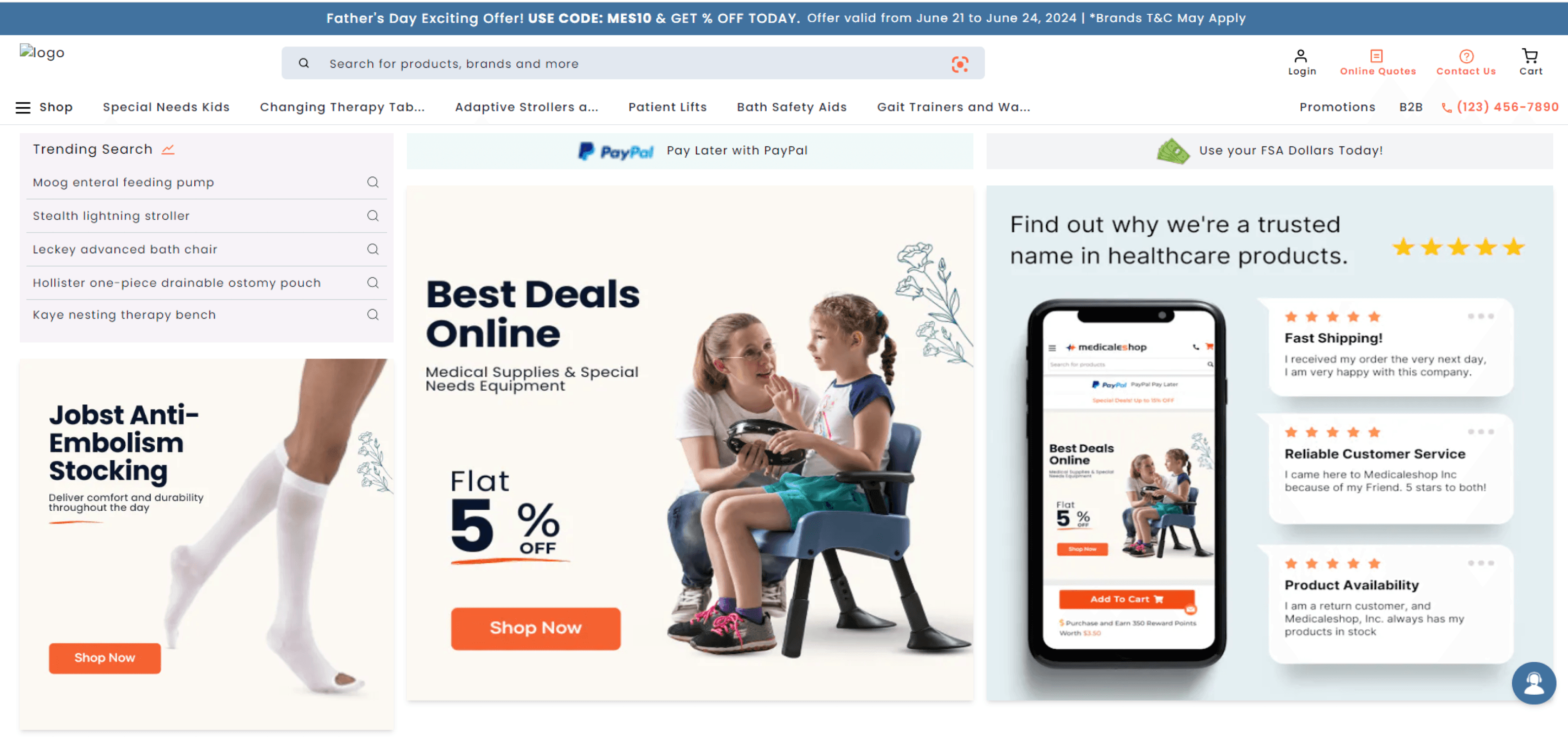
After Design changes
After Design changes
I made changes by using soothing colors for the elements, ensuring they attract attention effectively.
I made changes by using soothing colors for the elements, ensuring they attract attention effectively.
Homepage Aesthetics
Homepage Aesthetics
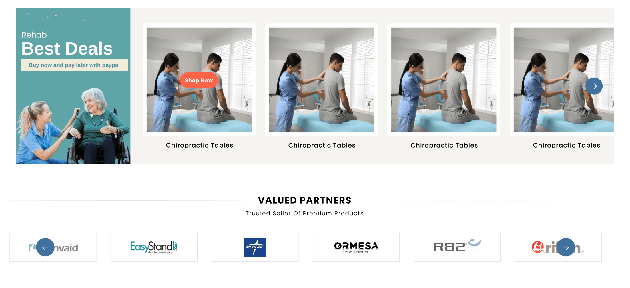
I matched the banners with the highlighted elements to make the homepage look harmonious and organized.
I matched the banners with the highlighted elements to make the homepage look harmonious and organized.
Before - To attract attention, the team highlighted the important elements in orange color, but this made the section look messy and disorganized.
Before - To attract attention, the team highlighted the important elements in orange color, but this made the section look messy and disorganized.
Gestalt Principle of Similarity
Gestalt Principle of Similarity
The Gestalt Principle of Similarity states that elements that look similar are perceived as part of the same group.
The Gestalt Principle of Similarity states that elements that look similar are perceived as part of the same group.
Category scroller
Category scroller
This section was unorganized and hard to navigate.
The product cards were too large.
The scroller moved only one product at a time, causing user frustration.
This section was unorganized and hard to navigate.
The product cards were too large.
The scroller moved only one product at a time, causing user frustration.
After Design changes
After Design changes
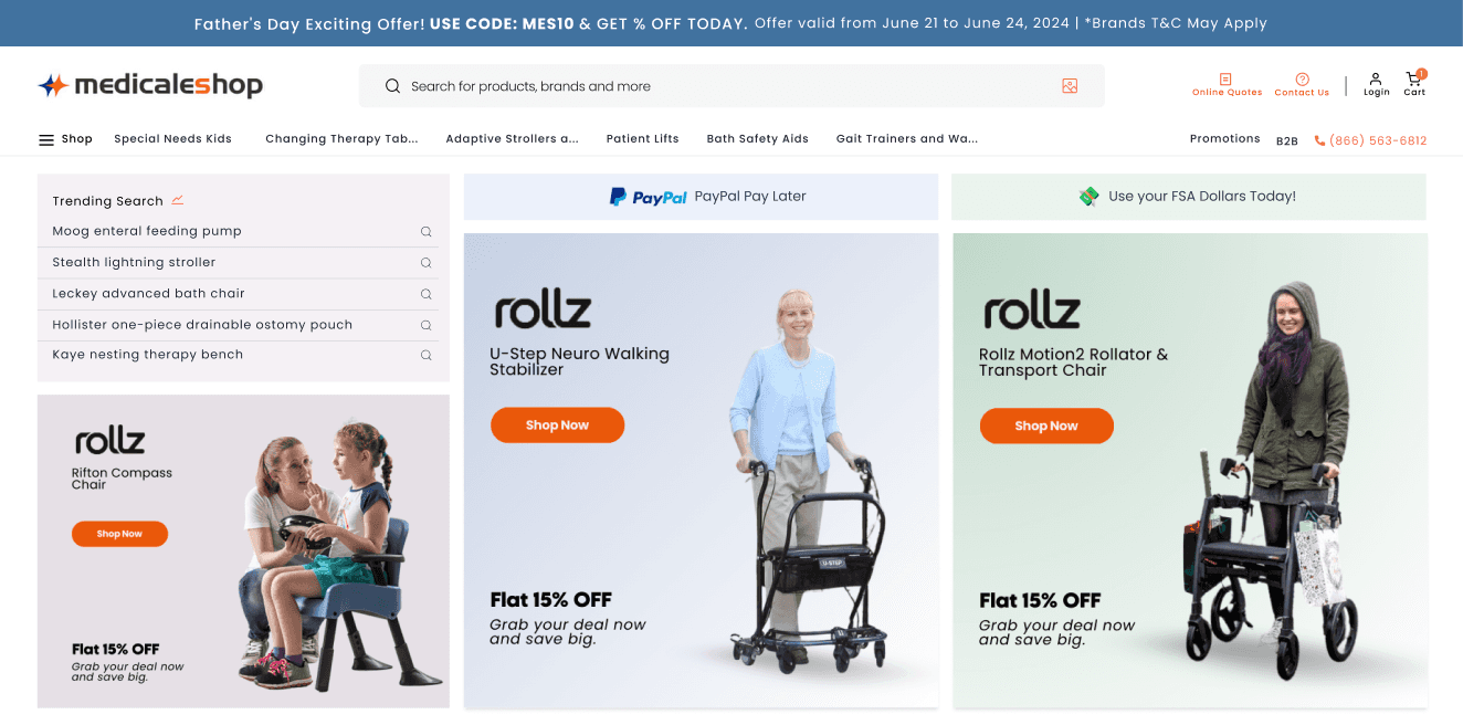
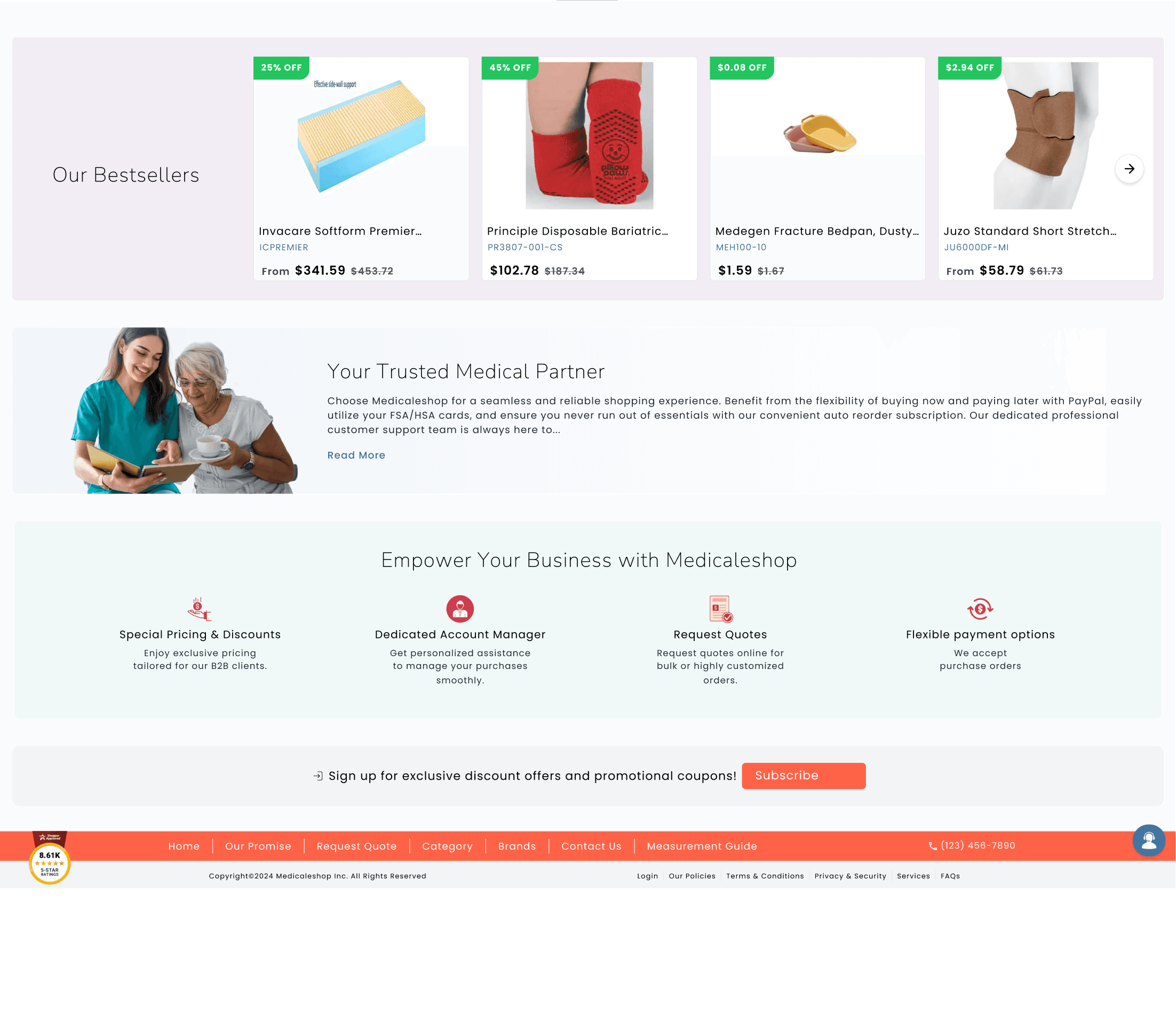
I added more human touch banners to create empathy throughout the website, helping users feel more connected.
Showing examples of people using the product has a greater impact than just writing about it.
I added more human touch banners to create empathy throughout the website, helping users feel more connected.
Showing examples of people using the product has a greater impact than just writing about it.
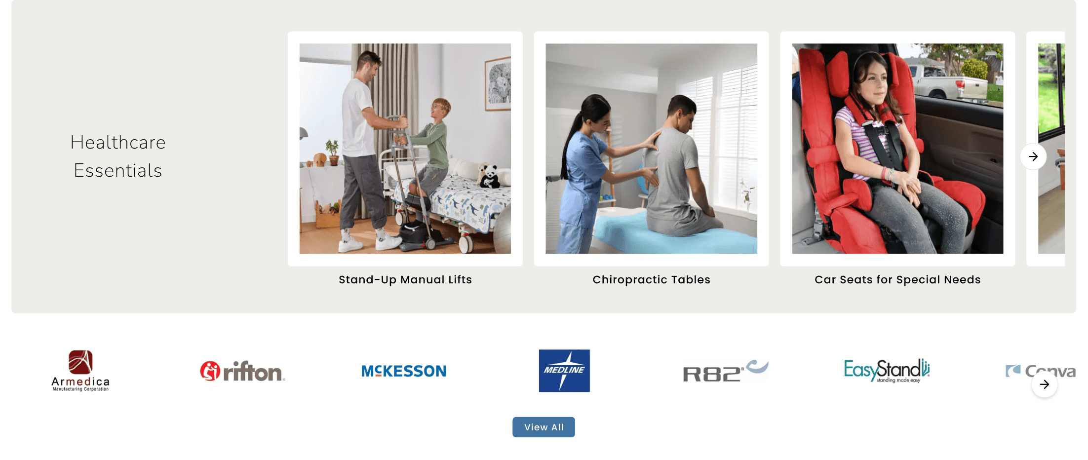
Valued Partners
Valued Partners
Nomenclature is important for users to easily filter out information. Clear labeling and descriptions improve understanding and navigation
Nomenclature is important for users to easily filter out information. Clear labeling and descriptions improve understanding and navigation
Breathing Space
Breathing Space
Given proper breathing space and lines so the section looks clean, aligned and organized.
Given proper breathing space and lines so the section looks clean, aligned and organized.
Category Section
Category Section
The text and logo appear to be stuck inside the circle.
The text and logo appear to be stuck inside the circle.
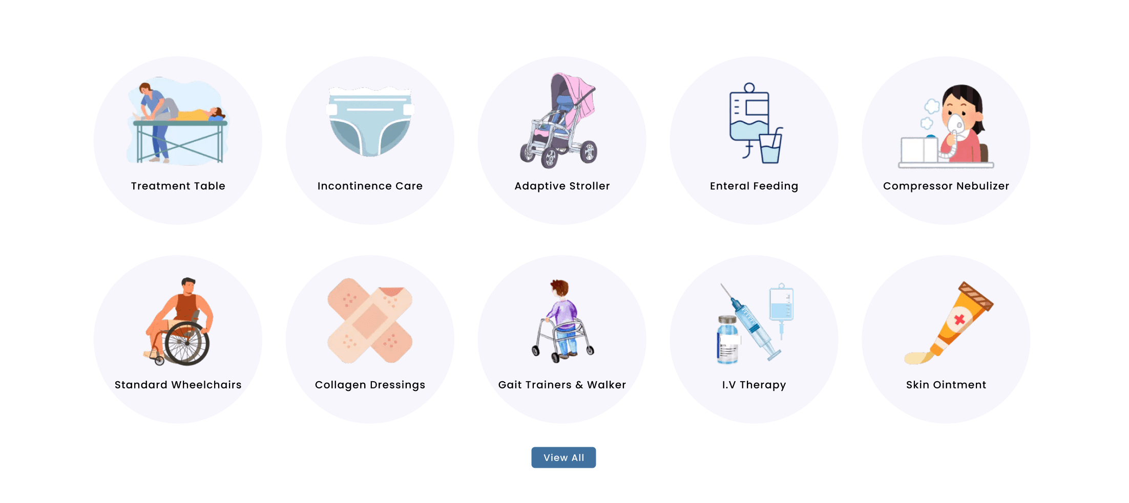
Moved the text to allow larger text to fit without being stuck.
Moved the text to allow larger text to fit without being stuck.

Overwhelming colors
Overwhelming colors
Using too many colors caused irritation and made it difficult to focus on one thing comfortably.
Using too many colors caused irritation and made it difficult to focus on one thing comfortably.
Harmonized colors
Harmonized colors
Using different color families for elements was irritating to the eyes. I used a consistent color family and limited the palette to two colors per frame to reduce visual overwhelm.
Using different color families for elements was irritating to the eyes. I used a consistent color family and limited the palette to two colors per frame to reduce visual overwhelm.

Website Before
Website Before
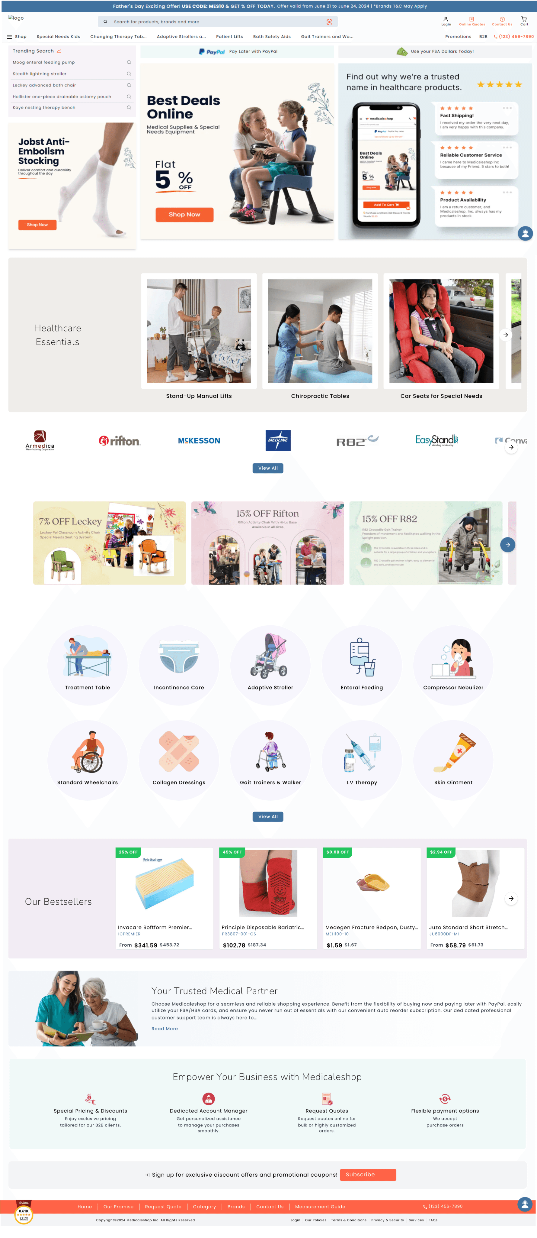
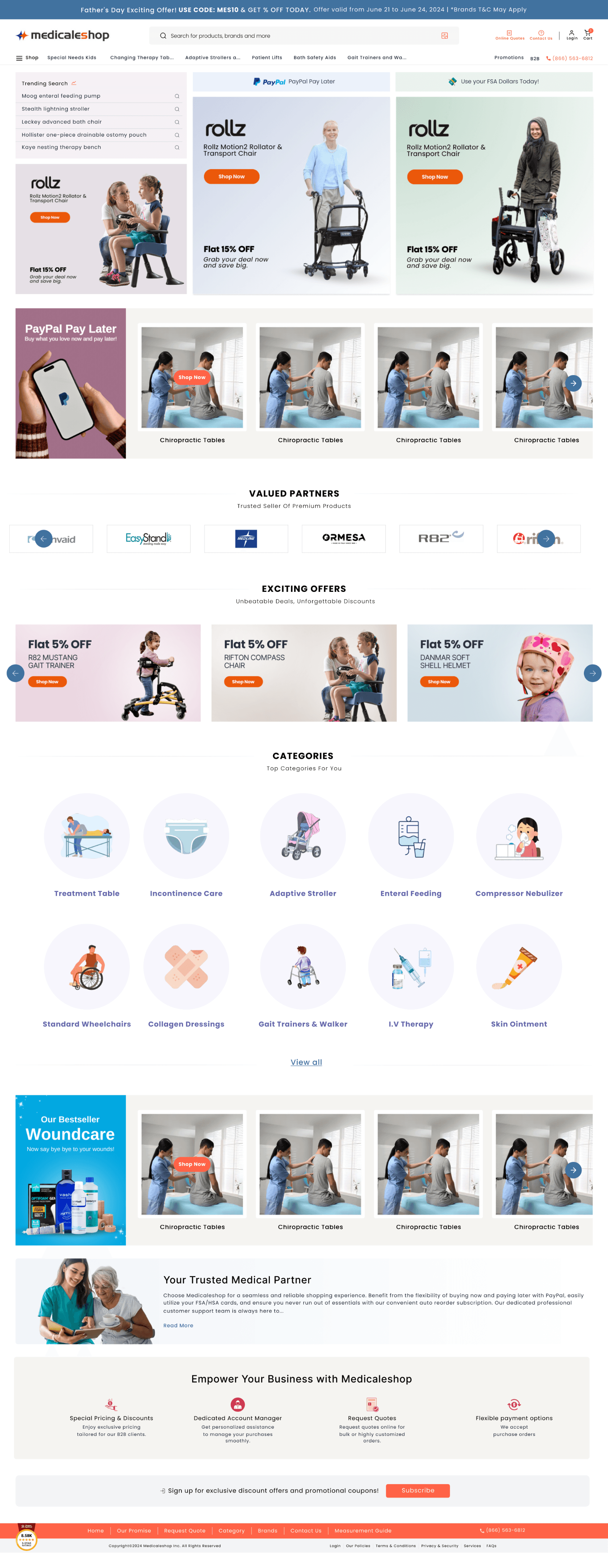
Website After
Website After
Thank you for sticking until the end
Check out the live test website -
Thank you for sticking until the end
Check out the live test website -
Thank you for sticking until the end
Check out the live test website -